Design:
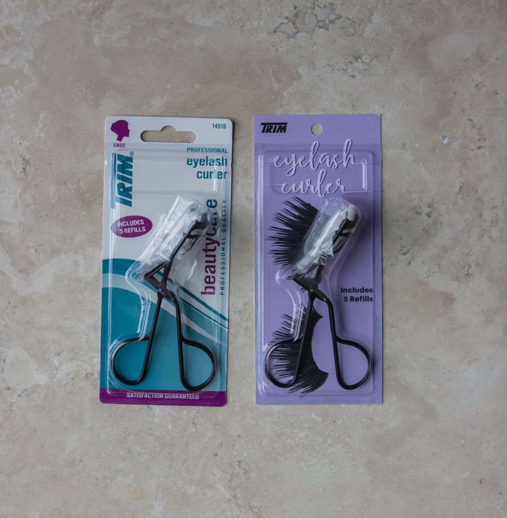
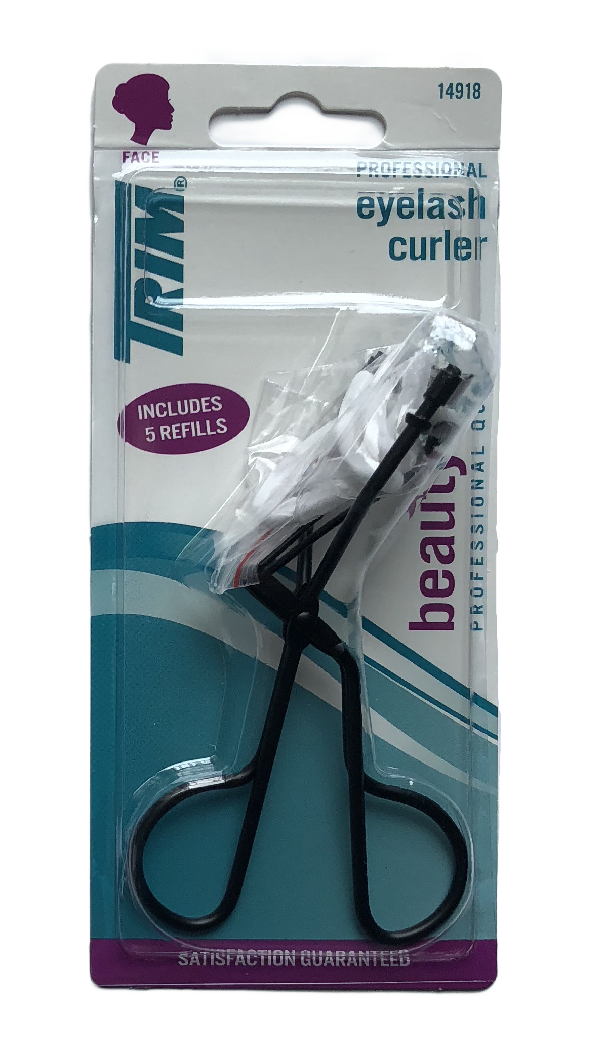
For this project, my goal was to redesign an ugly package. I never really paid much attention to packaging until this project. It’s amazing to see how many ugly packages are out there. As I was looking I discovered that all eyelash curlers had ugly packaging. All of them. If you don’t believe me check out Walmart’s eyelash curler selection here. I ended up picking Trim’s eyelash curler because the package was very dated. I’m actually pretty sure that Microsoft had a power point presentation that looked like this in the early 2000s.
Once I picked my product it was time to do some research. I started a Pinterest board dedicated to pretty packaging. I also went to Sephora to see how makeup was being packaged. When I was at Sephora I realized a few things. All makeup packaging is either black and white or it’s shiny (metallic or iridescent). From this I knew I wanted to do something different from the trend. I did some sketching and then I dived right into Illustrator. I came up with two different ideas.
After I got my basic typography down I then added some design elements to it.
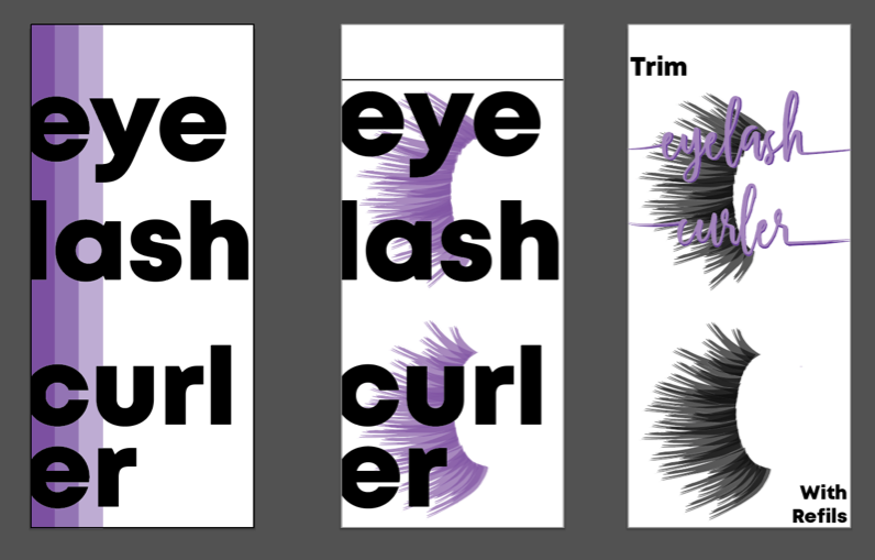
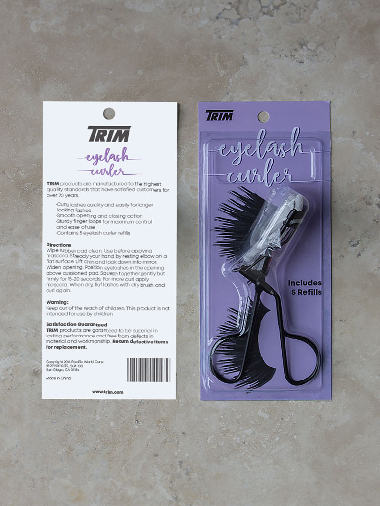
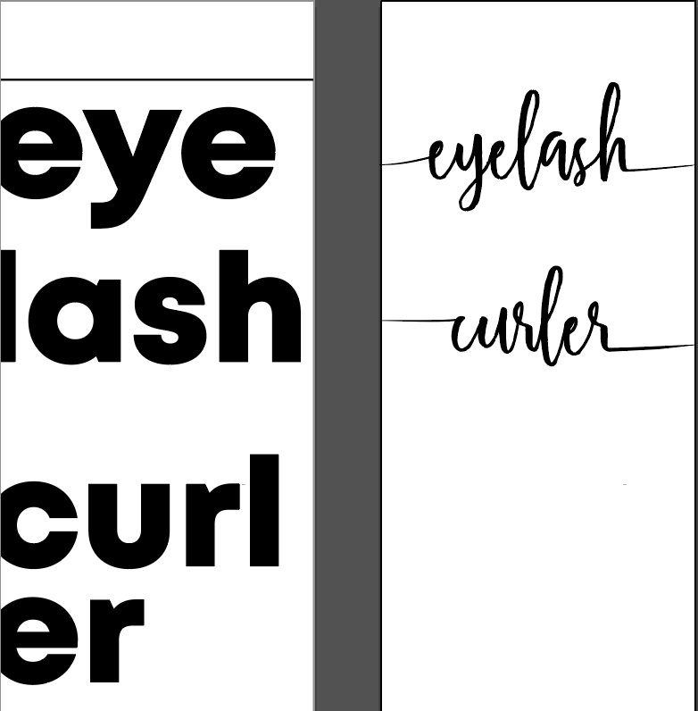
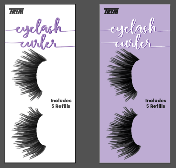
I really liked the look of the eyelashes. I thought it was a good idea to put them on the package because that’s the reason for the product. I also figured the cursive would be a better idea since the eyelash curler lays on top of the package. I knew that my design needed some work because there wasn’t a lot of contrast between the text and the lashes. I then realized that the eyelash curler would cover up the words. All of this lead me to the next design.
After this I got critiques. One of my peers suggested making the background purple. I did that and then I was torn. I knew I had to fix the eyelashes on the purple so I copied the shape and put a second layer on top of the lashes to help make more contrast. I also changed the purple to a lighter shade to help add more contrast between the lashes.
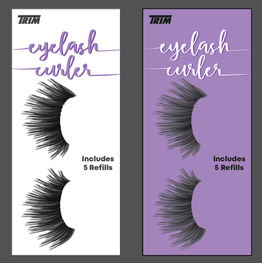
I thought they both looked good, and I decided to hold a poll on Instagram. From this I learned that initially people liked white but once they saw a rough draft of the product white and purple were split 50-50.
From the poll, I couldn’t make up my mind so I went to Walmart and I put the sample prints up in the store to see if that would sway my opinion.
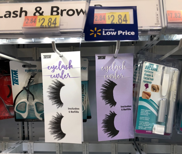
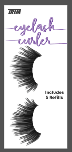
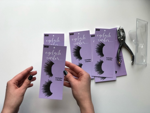
As I was looking at the prints in Walmart I realized how all of the packaging was white and purple stood out more. It also broke the trend that all other makeup packaging was following. Once I made that decision it was time to print.
I went to Alpha Graphics here in Rexburg to print. While I was there the employee informed me that their printer was having an error and it could not be fixed until the technician came in on Monday. He did tell me he could sell me this splotchy print for 40% off. It was bad there were white dots all over the purple. I then asked him about any other print places I could go and he directed me to Speedy Cps in Rigby the next city over. I went there and their printer was working great. I got a lot of copies and it was time to assemble the product.
Assembly:
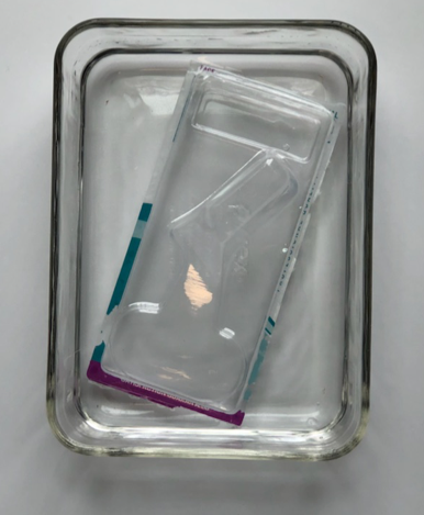
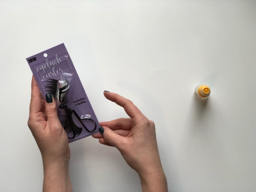
- First I had to open the package.
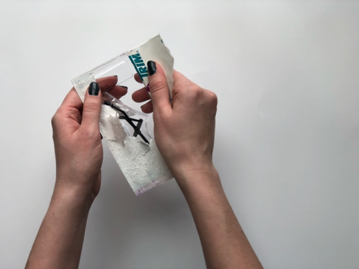
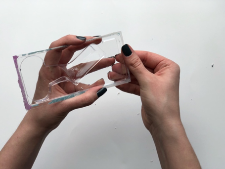
2. I then soaked the package in water to help get rid of the paper.
3. I then rubbed some of the paper off.
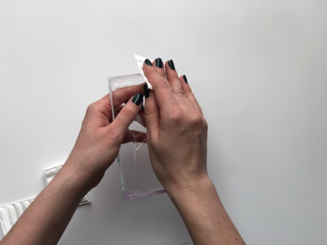
4. After that I used nail polish remover to get rid of the excess ink and some glue.
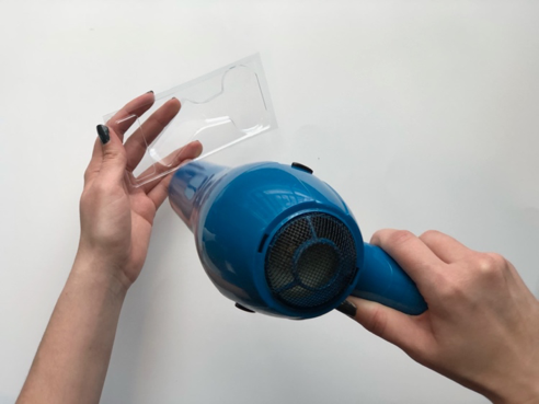
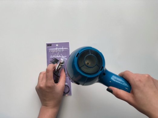
5. I then used a hair dryer to dry the package and get rid of all excess lint.
6. I then had to pick out a sheet to be the background.
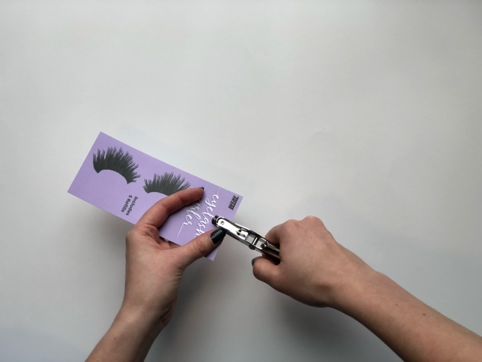
7. Once that was chosen I had to hole punch the paper so it could hang in the store.
8. After that I had to put the product back into the plastic packaging.
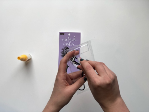
9. I then applied glue to the edges of the package.
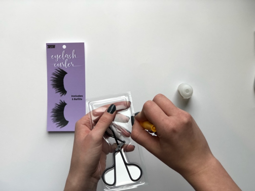
10. I attached the plastic and the paper.
11. I then used a hairdryer to dry the glue.
Everything went well. I ended up putting a little too much glue on the plastic so it looked a little weird on the edges but overall I think it looks great, especially when compared to the original.