
Making a Skeuomorphic Swatch
This was quite the project, but I’m excited to share with you what I’ve made! In order to get started I had to pick a watch, and I picked St. Catherine Point Swatch from 1988. I love this watch because I really like the colors, the design, and I’ve been obsessed with Swatches for a while. Anyways, once I picked my swatch it was time to sketch. Once I felt comfortable with my watch it was time to take it to illustrator. 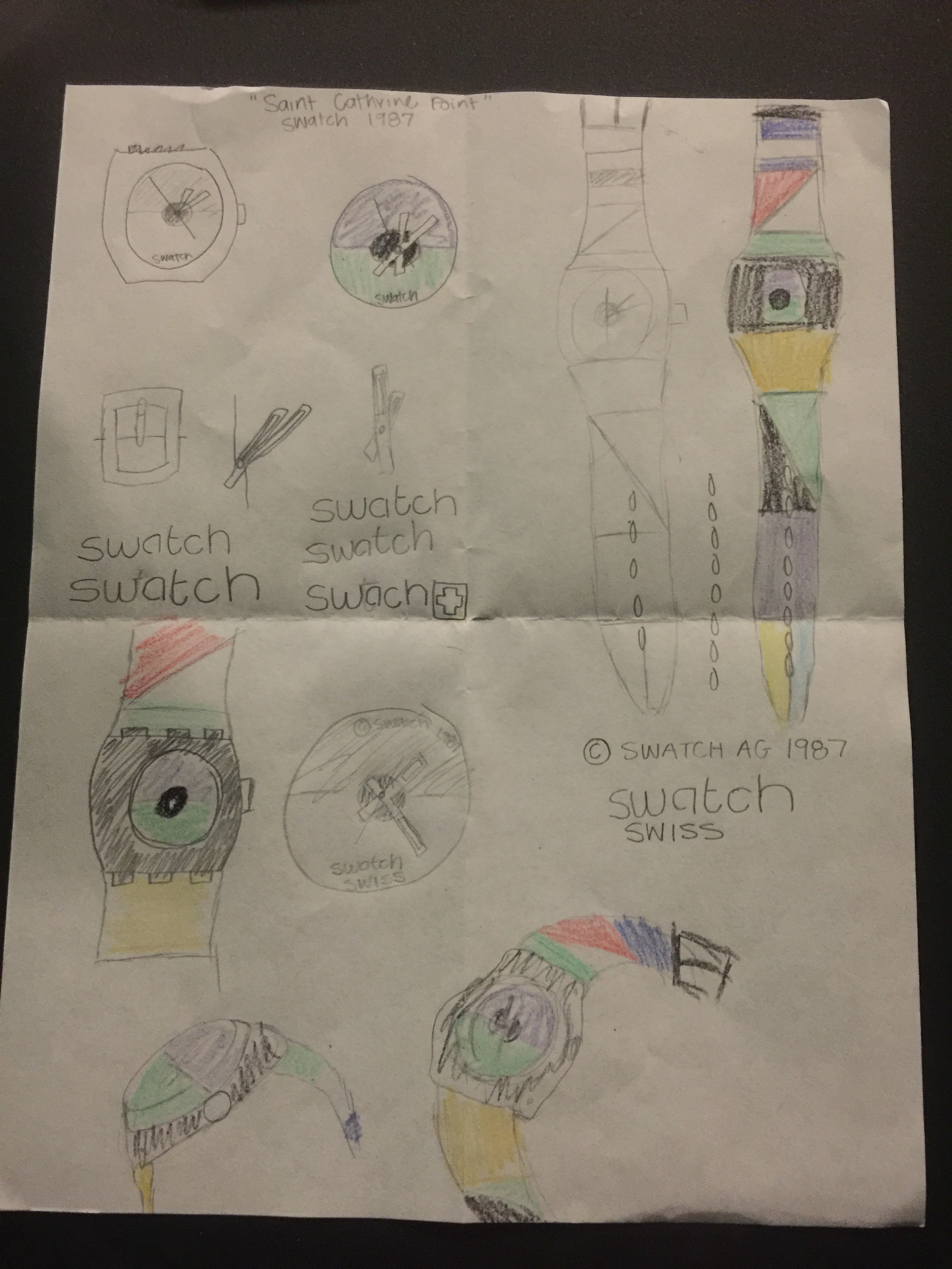
Say Hello to the beginning of my swatch:

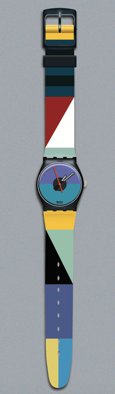
Once I had the basic shapes I began making the swatch look “photo realistic”. I started with the yellow band at the top.
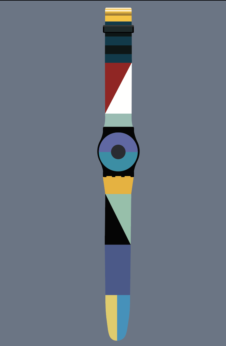
I then went on to add in other parts of the watch including the buckle, and watch face. I also tried to add some shading to the bottom yellow chunk as well.
All of the images above were made the first week. The rest of these photos were done the second week. Anyways, my focus became making the watch look photo realistic, or in other words skeuomorphic. I visited with Brother Kerr and he gave me some great tips on how to fix the buckle, and watch face. Which then brought me to this.

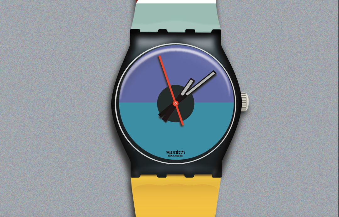
I then thought that this needed some shadow and that would make it look realistic. So I I created shadow, and then posted it for my peers to review, because I thought this was pretty good.
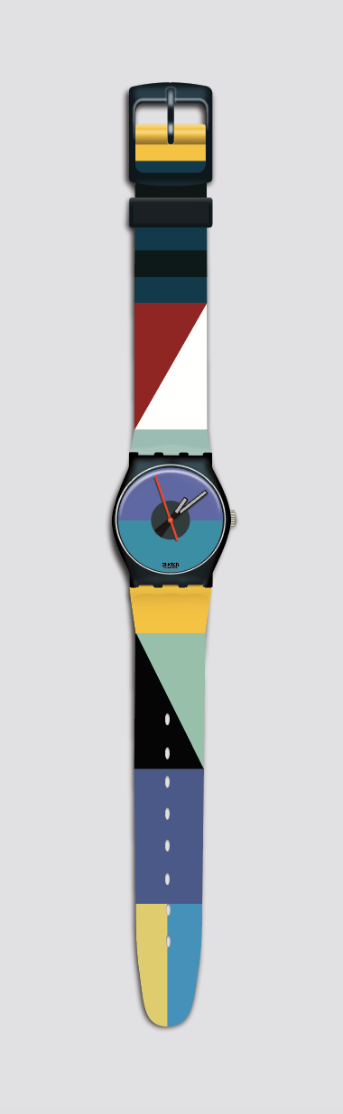
After I posted it I got some feedback and realized that I wasn’t done. I fixed the shadows, added a texture to the background to make it look more realistic, and then fixed my highlights to make them look less blue.
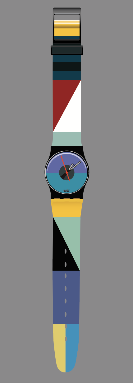
Here’s the original Swatch, my vector, and the paths to prove this is a vector. 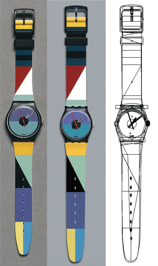
I originally posted this at http://vectorpaths.com/st-catherine-point-swatch/